Thursday, June 16, 2011

Project 3: Early Thoughts and Concepts

Clients:

1. Art Collector: Female, in her 50s, likes to display works, social
2. Photographers: Young couples (Art Collector's daughter + partner), in their late 20s, prefers a degree of of detachment from the outside and a world of their own.


1. From Project 2: Analysis of Antonio Carlos Siza House
-> "Tree of Life" where central dividing garden wall connects to private spaces.

Carrying the same idea: there will be a central element throughout the design that connects a particular type of space. e.g. stairs connecting mixed use areas shared by both public and private users.

2. (section) Interlocking spaces, providing mixed functions and interactions.

3. (plan) Simple overall geometry. However, site context would influence placement of internal wall/door elements to reflect landscape geometry.


Nominated section:
RED = Public
ORANGE = shared between Public and Private
YELLOW = House 1
BLUE = House 2

Tuesday, May 3, 2011

Project 2: Submission - Model Series + Final


1. Colour

"What if the colours of the exterior and interior exchanged?"

With a white interior, space is perceived to be heightened, and also not as clearly defined.

If the exterior colour, yellow, is to be exchanged to the interior, wall elements may be overwhelming for the psychological mind due to its intensity. This may cause degrees of intimidation and nervousness - thus not an ideal house-life.


With an exterior yellow facade, the effects of the sun shining onto the surfaces will reflect off each other (e.g. internal courtyard), which would then enter the interior space, producing a yellow-glow/cast to the rooms inside. The white interior walls directly exposed to the openings will hence reflect the yellow tinted light back into the rest of the interior, behind solid walls.


2. Detailing/Whole


Through geometric analysis, there is a centralised space (circle) through which the dividing wall invades. The triangular elements such as that of the internal courtyard and the wall-to-column connection across the U-structure superimposes with the circle.


3. Zoning/Spaces (Exterior vs. Interior)


The garden entirely envelopes the built mass.


The garden wall intruding the leg of the U-shaped house, 'merging' the landscape with the artificial. However, the raised base of the house signifies its alienation to the natural environment.


4. Final (combined ideas)
- Proposal for activities interacting both exterior and internal spaces, in an imagined landscape


In proposal for improving the interaction between spaces both public and private, exterior and interior zones, I would embrace the idea of the "Tree of Life" in which a central element (similar to that of the dividing garden wall branches off to private spaces, in that geometry can be deduced in terms of their connection to the whole site.


Project 2: Thoughts + Interpretations


1. Development a rich understanding of the use of colour (or lack thereof) in the building, and the relationship between this and a possible house-life.

"…light of the Atlantic is long and low, illuminating poverty in an abstract way: revealing all surface irregularities, every change of path around the house…"
Siza rejects "pre-established language" and believes: "architecture is not an arbitrary system of forms, growing directly out of our needs, interaction with the environment, and who we are"
Colour Psychology:

Yellow

White

Warm

Cold

Intensity

Neutrality

Attention-grabbing

Heightened perception of space

Strongest psychological colour


Built in the Post-Modernism period, there was a need to reintroduce "ornament, colour, decoration to buildings", challenging Modernism with emphasis on elements based upon personal preferences. This resulted in a diverse set of "rules" that refuted notions of "pure" form.
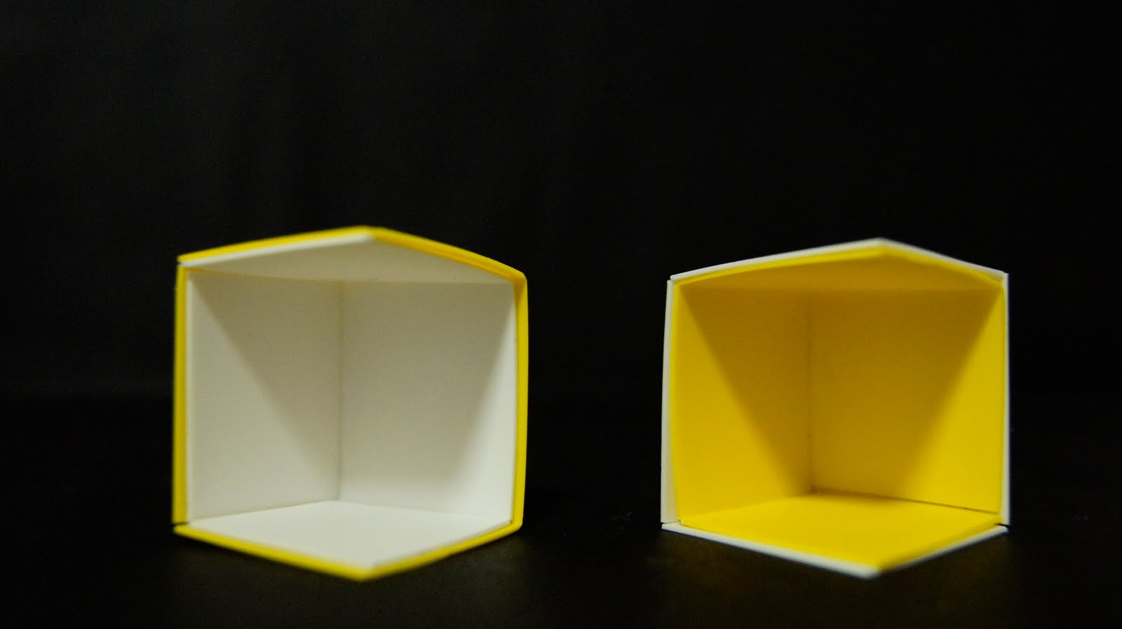
N.B - Antonio Carlos Siza House's external facade is YELLOW, but with WHITE interiors.
Experimentation Model of Room (in set):
"What if the colours were exchanged between interior and exterior?"
- Does white really heighten the perception of space?
Though it is not obvious at this scale (1:50), white would seem to heighten the perception of space compared to yellow due to yellow's intensity which may be confronting at times.
- How would an yellow interior affect house-life?
Continuously living with yellow interiors would affect one's perception of colours as its colour reflectivity would be quite different in comparison to the white. In this case, natural adaptation would lead one to gradually perceive yellow as white. According to food psychology, yellow may increase one's appetite and speed of consumption.
- Why yellow?
Yellow is claimed to be a 'creative' colour. Siza's work tends to conflict with the others as he adds "characters", supplying the Antonio Carlos Siza House with a strong and bold yellow facade.


2. Closely look at the relationship between the detail and the whole in the house and its garden and map this is terms of the building's use.

Internalised space - the central space = circle, enclosing the three (children's) bedrooms
Permeability/ "flowing spaces" - sliding doors are used to define these bedrooms located at the leg of the U-shaped structure
Irregularity - walls placed at discrete angles to the main U-shape, adopting 'multiple characters'
Tension - the placement of the courtyard, walls, columns + intruding geometry (superimposition)

3. Map the relationships between interior and exterior spaces in the building; study the way these bear on the rich patterns of programmatic occupation. Do they suggest a possible ideal life?

Zoning - Garden vs. U-Shape
Irregularity - wall elements + intruding diagonal garden wall.
Interior private spaces branching off': "The Tree of Life".
Exterior - the garden + invading wall + 'merge'
Raised base of the house = alienation between landscape and the built
Internal courtyard - private outdoor area (central location) , almost enclosed by the "U-pinch"

Wednesday, March 23, 2011

Project 1 - Submission: Group Model

Antonio Carlos Siza House

on Sao Jao De Deus, Santo Tirso, Portugal.


Project 1 - Submission: Drawings


Project 1 - Drawing Analysis Drafts


Project 1 - Research: Siza


Notes: Main Ideas/Concepts

  • A framework of tensions, both precise and emotive, attention and discomfort
  • Conceals and reveals - allows one to see, more relevant than interpretive
  • Elements removed with care: acute angles, curved shapes
  • Minimalism
  • Incisions and superimpositions
  • "Architects don't invent anything, they transform reality"
  • One has to discover the entrance as an elision between parallel walls rather than a direct opening
  • Striving to complement the natural geological structure
  • Continuity of the enclosed wall
  • Siza: a situationist, old landscapist
  • Pre-existing and desire for transformation
  • Process of fragmentation
  • Abstract configuration
  • U-shape: both attitude to form and shape, "flowing spaces"
  • Rooms are never never completely enclosed, one corner or side let open to mediate with adjacent, equally permeable compartment
  • Dynamic and static space
  • Suburban surroundings
  • Challenged precedents and conventions
  • Environment recede gradually, narrow path along garage stairs, courtyard framed by overgrown walls

Source: Alvaro Siza (1954-1988), A+U (1989/June) pg. 174-196


  • Modern absorbs elements of post-modernism
  • Bay window: centralised element
  • urban, secondary street, single-house surroundings
  • Irregularity: not approved on street fascade
  • "Away from the street" - internalised space
  • Heights = functions
  • Distorted proportion - exaggerated by bay windows
  • Compressed garage, extended wall fence
  • Steps: slows down movement (turning paths)
  • Dominate central axis (axial dominance)
  • Inverted angled courtyard
  • Public vs. private by simple geometry
  • No repetition, bringing together discrete features
  • Multiple personality, e.g. twisted column


Source: ARCH1201 Lecture, Catherine Lassen (7th March 2011)